“Whatever the current term for ‘hip’ is, that’s what we want to be …”
This, I’m told, was the EAC Rebranding Task Force brief to the bilingual design team chosen to look into the organization’s midlife crisis, the youthful Costa Leclerc.
“That’s a startling design — it will be fun to write about it.”
This was my reply to Anna Williams and Michelle Ou when they asked me to write this blog post.
Melva McLean, chair of the task force, attributes the rebranding idea to the fertile mind of Michelle Boulton, who wanted EAC to stand out from the rest of the networking communities and sites, and to establish its value for younger editors and writers as well as for corporate clients. Melva also points out that the task force was looking for a design that makes an international statement and works across languages.
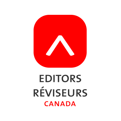
 Sitting at my laptop, the first thing I noticed in the design sample for the sleekly renamed Editors/Réviseurs Canada was the new colours: they vibrate onscreen. It’s clear that one aim of our communications is going to be playfulness — playing in the big leagues? The catchy layout of the pages connotes the online experience. For web pages, the association’s restated, renewed themes are presented in a row of tabs: Hire (marketing our organization and our members), Members (serving current members), Training (promoting best practices), Join (appealing to potential members).
Oh — did I tell you that the new web-friendly family of fonts we’ll be using is categorized as a set of androgynous fonts? Now you know.
I showed the design to Jaleen Grove, BFA (Visual Arts Studio Practice), PhD (Art History and Criticism). Jaleen has spent 25 years in visual communications as a hands-on designer and scholar. She immediately recognized a multimedia button, clean and simple, reproducing well across platforms. But, she asked, does the new design retain any link with print and books? Jaleen saw an arrow pointing upwards … or maybe “a book being mistreated”(!). I wasn’t quick enough to retort: “That’s a caret, if you please!” Melva had to tell me what it was a few days later in a phone interview that set me straight on many things.
One thing Melva explained is that in parallel with the name change and the new visual ID is a multi-year plan to renew our mission and redefine our purposes, aims and ambitions, seen as a unity … so that, as Carolyn L Burke says, “we are our new brand.”
Now with social media platforms and The Editors’ Weekly gone live with the new look, the rebranding process is well underway. Watch for the rest of the rebrand and our new website, to be launched in the near future.
The last word goes to Carolyn: “Simple. Fun. Confident. Professional. Current. Skilled. These are some of the words which truly represent our members, and which inspired a new look. Our new logo, with the beautiful PT Sans font and bold red, captures these values. Can we live up to these? Editors Canada members already do.“
Check out the new brand here.
Editors Canada Task Force: Melva McLean, Tina Dealwis, Marlene Dong, Namita Kumar, Andrew Wright
National executive council rep: Moira White
National office reps: Carolyn L Burke, Michelle Ou
The Editors’ Weekly is the official blog of Editors Canada. Contact us.
Discover more from The Editors' Weekly
Subscribe to get the latest posts sent to your email.
Cy Strom
Cy Strom has been a freelance editor for years, many of which he spent on EAC's Committee on Professional Standards. He edits in several fields and was a recipient of the Lee d'Anjou Award for volunteerism.